Tara Anand x LA Times
Thursday December 8th evening:
I received an e-mail asking if I was available for the job they were planning to publish thursday of the following week so I needed the final by wednesday at the latest. The story was about the academic conflicts that plagues cannabis research funding. I received the draft of the story a couple of hours later. There were a couple of moving parts to the story as far as I could tell: newly legalized cannabis, university researchers and money. I worked on a few sketches with these elements to try to convey in a quick and snappy way what the article was getting at.
Friday December 9th: sending sketches over
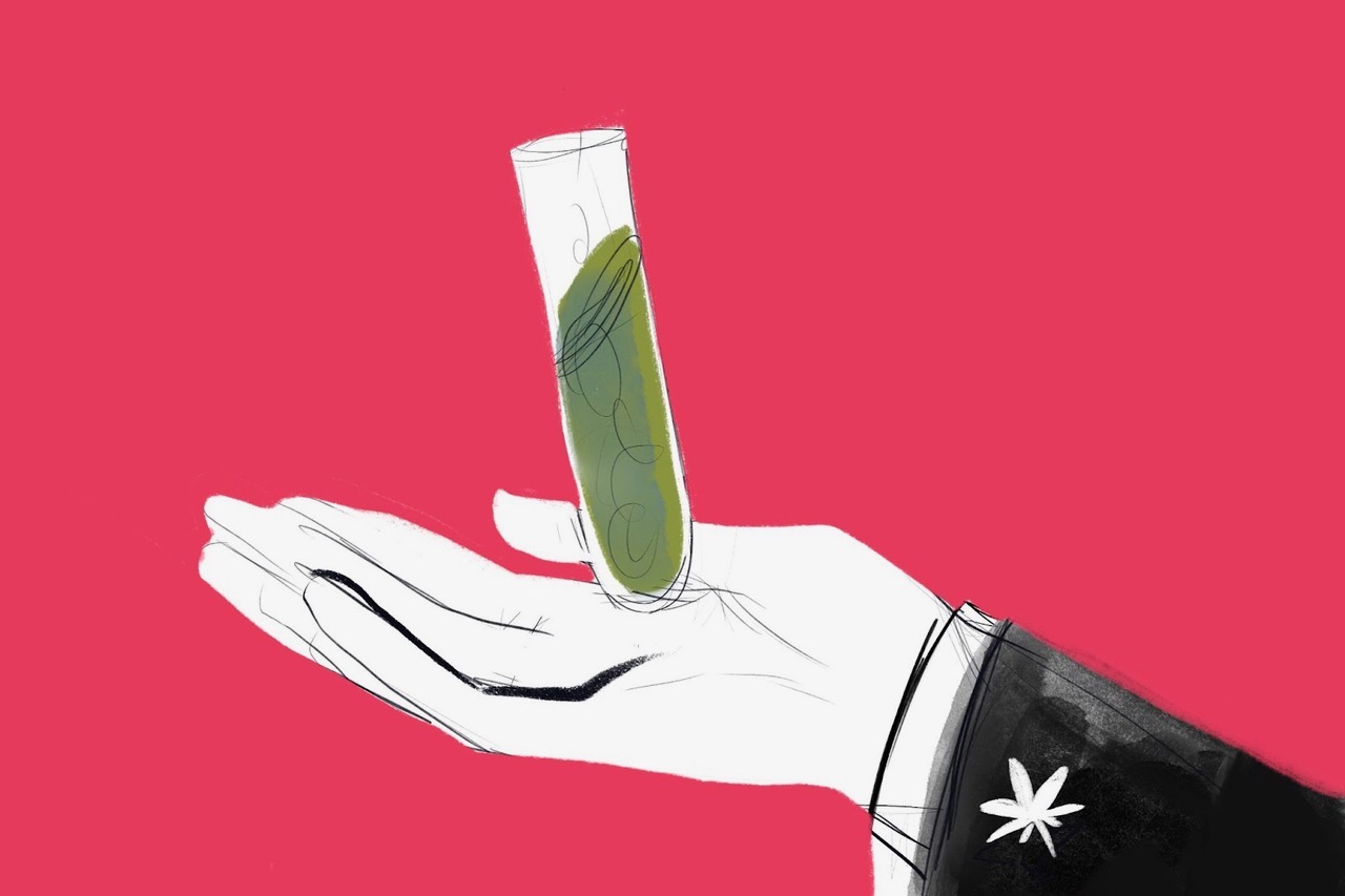
They had suggested this visual: A close-up of the torsos of two people, one wearing a white medical/lab coat and one wearing a suit with a cufflink in the shape of a weed leaf visible on the sleeve. It could be a close-up of the two shaking hands.
1. The first sketch was a riff on that: a hand with the cannabis cufflink holding a test tube. The suit suggested money/business and the visual echoes the phrase “__in the palm of their hand” meaning to have complete control over someone .
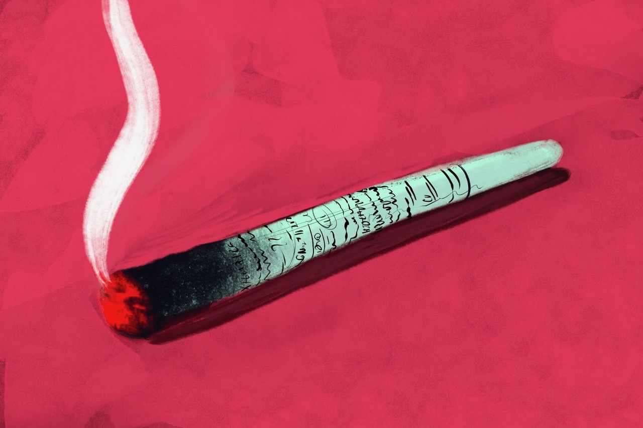
2. A joint rolled from research papers, we can make the text on the joint clearly chemical equations or terminology (I'm visually partial to this one!) - I really liked this sketch in terms of the visual but it definitely didn’t hit all the points in the article.
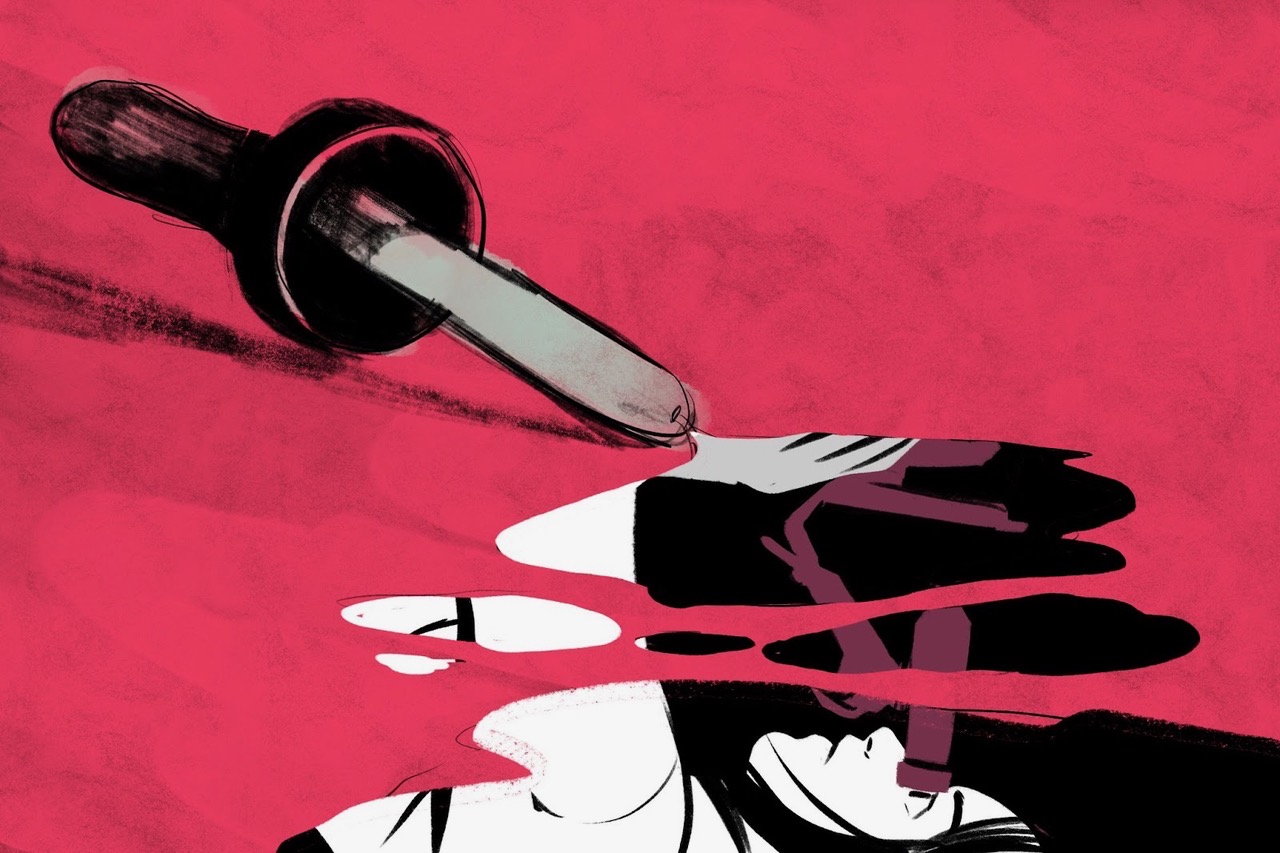
3. The piece specifically mentions that one of the larger groups is owned by a producer of tinctures and oils so this one alludes to that. That being said, the visual of a tincture is not really as easily identified with cannabit as say, a joint.
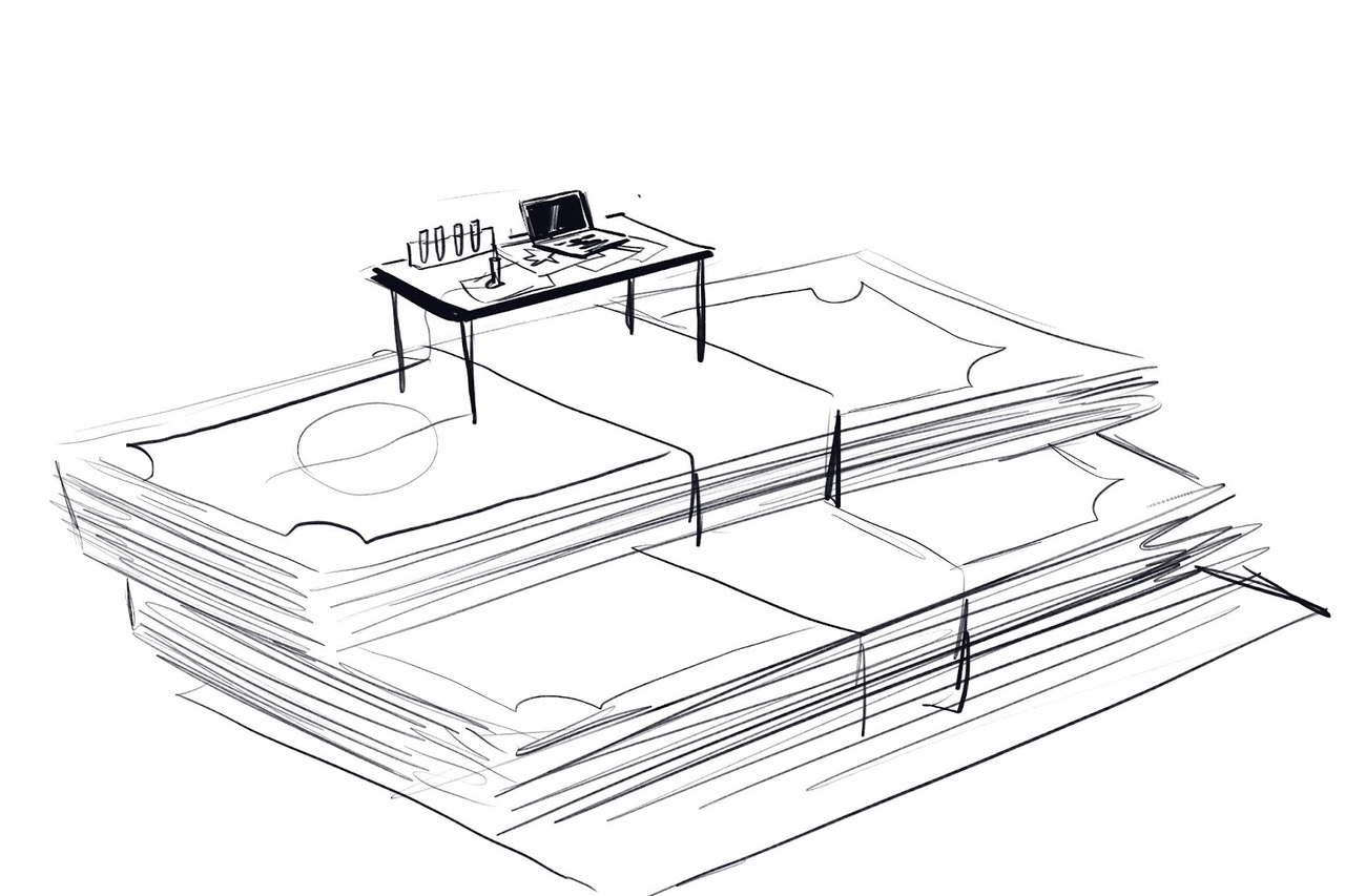
4. A stairway of money leads to the research table: I thought the money could have cannabis leaves on it.
Monday December 12th:
Idea 4 is the idea they eventually went with and the sketch I hated the most (so of course they picked it!). They wanted it developed a little more though so I worked up these colour sketches.
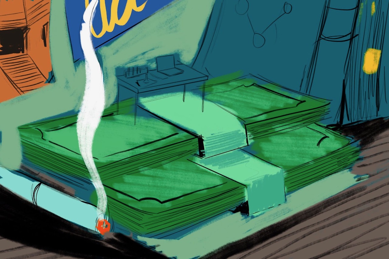

I developed the sketch a little more with imagery of college life (as suggested by them) and quickly realised the little desk on the money was an unnecessary solution. An image of money on the desk with college/research paraphernalia and a joint was quite effective too! Luckily they thought so too! So I began painting the final.
Tuesday December 13th:

Wednesday December 14th:
They thought maybe we could add a microscope and beakers/testubes. Since this was a gouache painting I didn’t want to risk overloading the paper so I made the changes in Procreate after sending them a rough block in of where they would go.

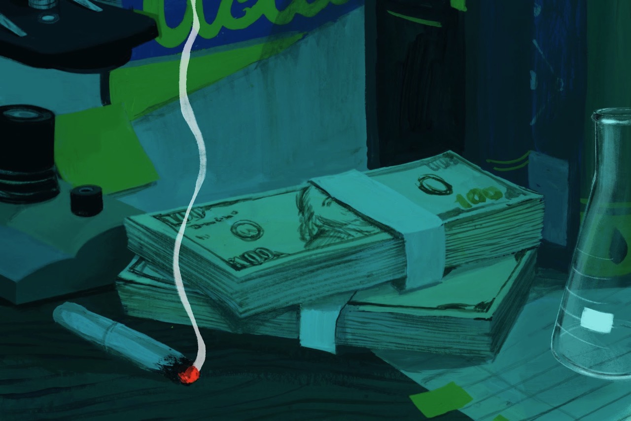
In the process I also upped the blues so that the red of the lit joint would stand out a little more so that the image was a little more striking!
They approved this and it was up the next day!
